A Murderous Complacency

murder: a flock of crows

~ Miriam-Webster dictionary

Many view the appearance of crows as an omen of death because ravens and crows are scavengers and are generally associated with dead bodies, battlefields, and cemeteries, and they’re thought to circle in large numbers above sites where animals or people are expected to soon die.

~ "Nature", PBS.org

Running PeakProsperity.com requires me to read and process a lot of data on a daily basis. As it's hard to digest it all in real-time, I keep a running list of charts, tables and articles that catch my attention, to return to when I have the time to give them my full focus.

Lately, that list has been getting quite long. And it's largely full of indicators that concern me; signals that the long era of "extend and pretend" in today's markets may finally be at its terminus.

Like crows circling overhead, every day brings with it new worrisome statistics that portend an ill change ahead. Indeed, these omens are increasing so quickly now that it's hard not to feel like Tippi Hedren in Hitchcock's suspense classic The Birds:

So what are the data that make me think these crows will soon be feasting on the carcass of the great bull market that has powered stock, bonds, real estate and most other asset classes to record highs since 2009?

Rogue's Gallery

Complacent Investors

Investors have enjoyed remarkably gentle treatment by the stock markets over the past half-decade. Retracements have occurred much less frequently than historical norms, and have been shallow and short-lived when they happened.

Tom Lee, head of research at Fundstrat and often referred to as "Wall Street's biggest bull" notes that 2016 was the mildest year on record for the S&P 500, with only 7 days in which the index traded at less than 3% of its 52-week high. Similarly, the 2013-2016 period has seen the lowest volatility of any 4-year stretch in history:

Lee notes that despite the record calm, annual returns are moderating. As conditions begin to mean-revert, he worries that lower prices are ahead and is predicting a 5-7% market correction in the first half of 2017.

JP Morgan's lead quant Marko Kalanovic also issues a striking similar warning: "Following the recent rally, a level of risk complacency has started to set inThe ratio of S&P 500 Puts to Calls has dropped to a ~3 year low, and the VIX reached near-record lows of ~10. " He, too, is calling for a ~5% pullback in the first half of this year.

Bizarre Price Action

Assets like stocks are (or, at least, are supposed to be) valued based on expectations of income. If income is increasing, then so should prices. But that's not what we're seeing.

The famed Dow Jones Industrial Average hit 20,000 for the first time ever on January 25th. Things must be going great, right?

Well, not that great. Wolf Richter shows that the total aggregate revenues for the 30 companies that make up this index was actually lower in 2016 than in every year from 2011 onwards:

Hmmm. Well, revenue isn't everything. At the end of the day, it's earnings that matter. Perhaps corporate America is becoming more efficient and posting record profits.

Nope.

(Source)

We're seeing a clear trend of rising prices in the face of lagging performance. One of those will need to correct. Which seems more likely? 

Dismal Outlook For Future Returns

John Hussman was been warning us for years that QE/etc has pulled all the value of future returns into present asset prices. Today's investor has to make a choice: either buy now and expect no/low returns for the next 10 years; or wait for a price correction in the markets and then buy at low valuations to get appreciation from there.

Lance Roberts visualizes this pickle in the chart below, which shows that, historically, markets as richly-priced as today's have offered sub-par annual returns for the following decade:
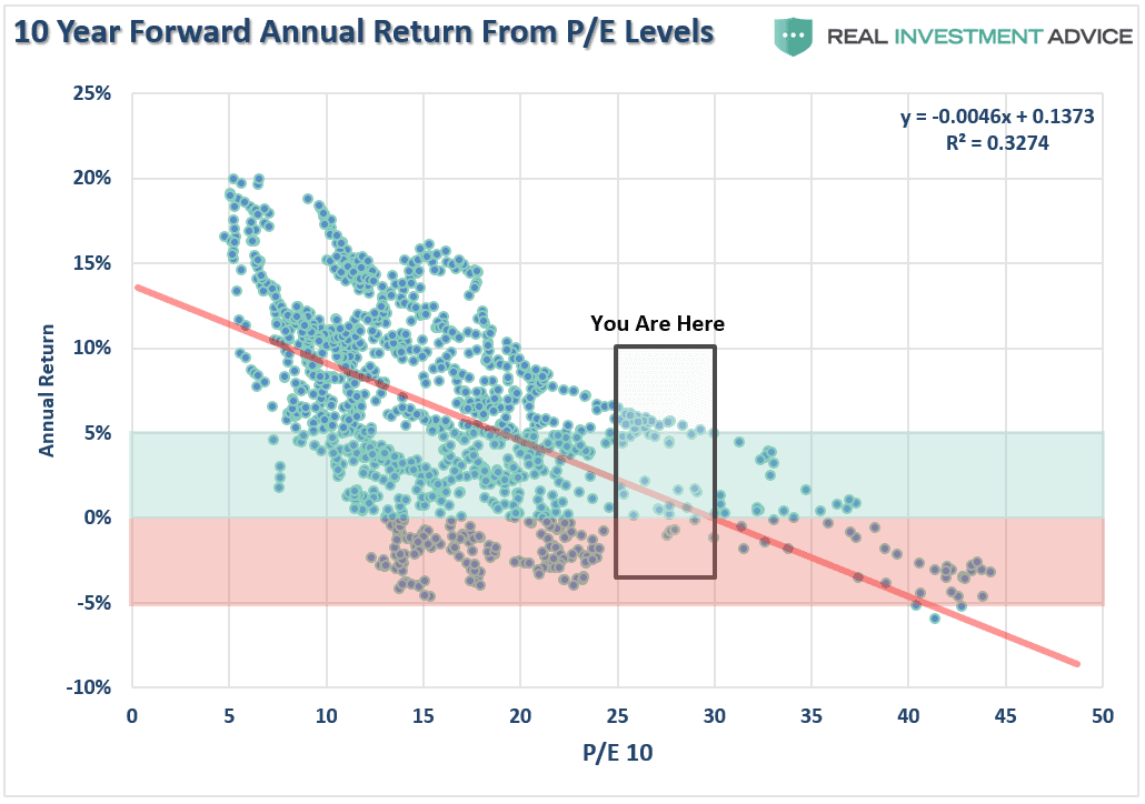
(Source)

As you can also see from the above chart, the S&P spends at lot less time at price-to-earnings (P/E) ratios above 20 as it does below. At today's average P/E of 28+, prices have a long way to fall when a return to historic averages occurs.

Complacent Consumers

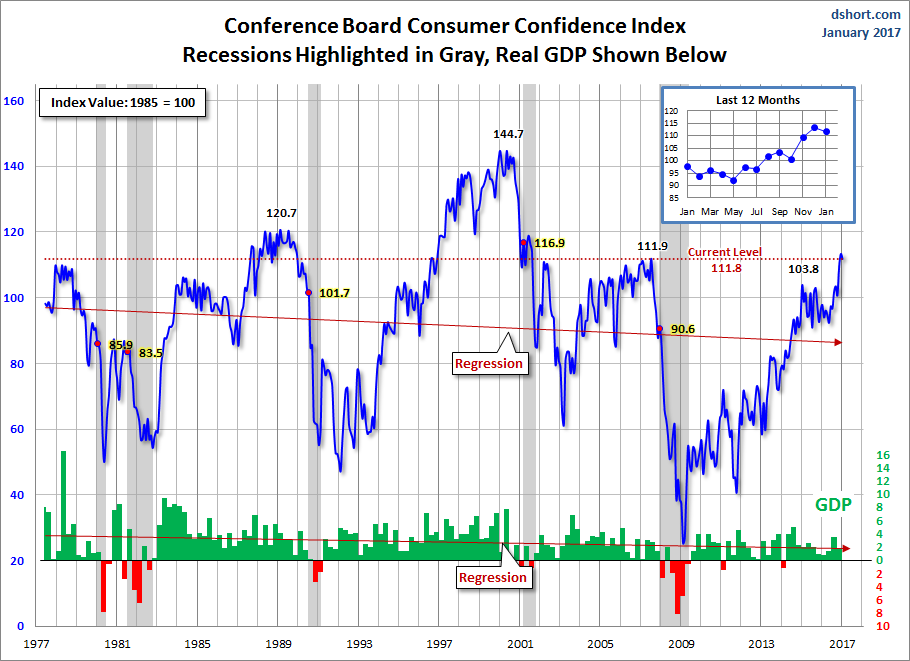
Like investors, consumers' worries about the future have dissipated as borrowing rates have lowered, and home and 401k prices have risen. Consumer confidence hit a 16-year high in December, surpassing levels preceding the 2008 financial crisis:

(Source)

Note how confidence levels at this current height are nearly always followed soon after by recession.

Bubblicious Housing Prices

The latest Case-Shiller home price index report shows that US housing prices have, in aggregate, for the first time exceeded their previous peak seen right before the 2007 collapse:

(Source)

Are current prices unsustainably high? Very likely. But what's not up for debate is an important point Zero Hedge makes about the above chart. It's latest data point is from November 2016 (that's the most recent Case-Shiller data available as of now). Mortgage rates have spiked dramatically since then. Given the mathematical 'see saw' relationship between home prices and mortgage rates, the most likely future trajectory for this chart is downwards.

Unbalanced Bets

The net result of all the above is that the vast majority of investment capital is crowded into the same trades. Trades, mind you, that anticipate the recent near-magical era of historically-low volatility and historically-high stock prices will continue unabated for the foreseeable future.

As in sailing, whenever everyone crowds to the same side of the boat, folks usually end up wet:

(Source)

So is it any surprise that those with a superior record of profitable trading (due, usually, to unfair advantage -- but that's a different story) are positioned very differently than the herd? Sentiment Trader's Smart Money/Dumb Money Confidence index is showing an historically extreme divergence, with the "dumb money" betting on a continued rally and the "smart money" anticipating a decline: 

A Reality-Check

Given the multiplying and shrilly-squawking omens of hubris and overconfidence in today's hyper-extended markets -- a murder of complacencies, if you will -- we conclude we've reached the point in this storyline where the suspense has risen to its zenith, and the real violence then begins. Hitchcock would be proud.  

We reiterate our advice to prepare for approaching mayhem in the markets. If you have money in stocks and bonds (in a brokerage account, retirement account, pension, trust, etc), please make sure you are working with a financial professional who is taking the above risks in mind in their approach to managing your portfolio (if you're having trouble finding one who is, consider scheduling a free consultation with the adviser we endorse).

If you're a homeowner, prepare for the probability of lower prices ahead. If you're thinking of selling your house in the near future, you may want to move up your timetable. Conversely, if you're a potential buyer, ask yourself if you can afford to wait until a correction offers better bargains.

Of course, a major market correction doesn't just affect the prices of stock, bonds, and housing. Through repercussions like job layoffs, company closures, cuts to social programs, and the like -- the mood and functioning of society at large is impacted.

And we're not the only ones concerned about what the future holds. Our recent report When The Rich Become Preppers, It's Time To Worry is a must-read for understanding that the average Joe is being played for a sucker by today's "everything is awesome" meme.

Those executives who run the companies we hold stock in? They're furiously preparing for a future of social unrest.

Click here to read When The Rich Become Preppers, It's Time To Worry (free to all)

This is a companion discussion topic for the original entry at https://peakprosperity.com/a-murderous-complacency/

“We’re going to war in the South China Sea in five to 10 years, aren’t we?” Mr Bannon said on his radio show in March 2016. “There’s no doubt about that. They’re taking their sandbars and making basically stationary aircraft carriers and putting missiles on those. They come here to the United States in front of our face — and you understand how important face is — and say it’s an ancient territorial sea.” - Steven Bannon
It has been 25 years Werner Herzog released his film, Lessons in Darkness, a somewhat allegorical depiction of the process of war. I just happened to suggest the film as a possible sample of what history has in store for those who forget the past. As we watched, my daughter and son-in-law were mesmerized by the images and had little memory of that time. My little grandson was also awestruck and pummeled me with questions as to the causes why this happened. I was somewhat at a loss for words in explaining the reasons this happened. Some of the participants of this forum have expressed their dismay in the undercurrent of the apocryphal tone of many of the contributors. Adam’s observations are indicative of that tone, but don’t betray the reality of the current state of the markets and the world. When powerful politicians begin to rattle sabres and predict when they will pull them out of their scabbards, we all should sit up and take note, especially when it is based on pride and ego. Reality, unfortunately, is the great leveler. Pray that we come to recognize it sooner than later. Herzog’s film may be more relevant than the Super Bowl. The eight minutes and forty four seconds is a worthy reminder. I don't think I'm going to sweat the markets.

Adam
I know you and Chris can’t give any recommendations. I would like any recommendations from market savvy PP members for a small time investor with at most four to six thousand dollars to invest in a short fund. I am up against the retirement wall coming and need to maximize my assets if I can. Any comments will be appreciated.

Thanks Adam, glad you keep those charts and graphs and share them with us!
As I read he article I kept thinking about the kids at a recent birthday party. Of course there was some indoor rough housing and I just knew the situation would end badly. 1) someone would get hurt or 2) someone would get upset or angry or their feelings hurt or 3) some household item would get broken. So, wait for it,…wait for it,… wait for it - yep a scraped shin a few tears an angry exchange of words and it was over. Moral of this article is - "Wait For It, …Wait For It, yep this will indeed end badly we can only "Wait For It to end badly. “Duh!”
AKGrannyWGrit

It’s times like these - when everyone thinks we are doing great(!) - when the hammer falls. Remember that a key element in maximizing profits from dumb money investors is creating the sense that high returns are inevitable and that if you’re not all in - you’re a moron. It’s supposed to work just like this to maximize the effect. Remember the wealth never disappears - it only changes hands.
The good news during these times is that everything is on sale. Even more so with the right wing lulled into complacency - guns and ammo prices are down!
Rector

I wish you would speak more often and more directly to the role of the “money masters” determining the rise and fall of markets and economies. Will President Trump threaten the central bankers monopoly on the money supply? Is he preparing to issue Debt free US Notes to replace or supplement Federal Reserve Debt based Notes ? Google Trumps final campaign speech, the imagery is unmistakable and it appears he is running against the central bankers with Hillary as only a representation of that order. Recessions and depressions happen when those controlling the money supply contract the supply of money, on purpose in order to fleece the unprepared. If President Trump threatens the money monopoly they will crash the economy as retribution.

Whooo Hooo - your article is right there on top in Zerohedge getting a lot of exposure.
You guys will be known as the ones who “saw it coming” and we will say - ah yeah we read them back in the old days.

codekiln wrote:

Are samples supposed to be gathered from an instant in time or from a range of times?
Are they from a certain collection of companies? If so, what was the profile of companies sampled? CAPE is usually applied to the S&P 500. Is this supposed to be the S&P 500?
Where precisely did Lance Roberts get the samples from?
Why wouldn’t Lance Roberts include a download of the samples, and instead only include an image in his article?
Here are some explanations which I hope you and others find helpful. We do tend to operate at a pretty high level around here because we’ve been at it for a long time. It’s always help to remember where we began, and to assume nothing because often deeper understanding results from the re-explanation.

Each dot on the chart represents the returns you would have gotten over the next ten years if you had bought the stock market at the indicated P/E 10 ratio. So we might imagine we bought the market in January of 2000 at a given P/E 10 ratio and then seen what we got over the next ten years. Then we might have done the same thing in February of 2000 and done the same thing. Each instance becomes a dot and those dots get plotted.

Do that enough and you can plot out a relationship between the two variables, as John Hussman has done with this same chart repeatedly (I’m not sure if Lance is copying John’s work or borrowing it…John Hussman is a great guy by the way, super class act, very thorough), and then you can see that buying at higher P/E 10 levels is associated with poorer future returns. Given that “we are here” between a P/E 10 of 25 and 30 John is saying that the expected future returns of buying here are somewhere between 5% and -2%. In other words, not terribly exciting, especially given the risks involved.

Here’s a recent chart by Hussman that shows the same thing, except here he’s showing that the expected returns of the stock market over the next 12 years are hovering just over zero. Given the risks, that’s not a tasty bet to make, and that near zero return won’t be coming as a nice, easy glide path.

(Source)

It will come with stomach churning drops and exciting rebounds.

And that’s if and only if nothing really goes wrong along the way, like a world war that shuts down the flow of oil in some damaging way.

Going short is a hard thing to get right. And by “get right”, I mean, make money from the trade. Because of the built-in expansion in money supply, the market has an “up” bias which means you start out with the odds against you from the get-go.
What’s more, the market has gone up (overall) since the low in 2009. So pretty much any time you would have gone short in the past 8 years, you would have ended up losing money - assuming you didn’t cleverly cover your short at or near the lows.
The way the game is played, losing money = “being wrong.”
Bill Fleckenstein is a goldbug and is interviewed regularly over at KWN. He too believes the market is due for a catastrophe, but he isn’t going short. He says its important to wait for the market to give some sort of price signal first.
What he means is this: to get the odds on your side, you have to wait for the market to show you that the uptrend has changed to a downtrend. That’s easy to say, but hard to actually do.
One well-known indicator is a series of lower highs and lower lows. That requires the market to sell off, rally back to a point that doesn’t quite make it back to its previous high, and then sell off again and make a new low. This pattern identifies a trend change - to a downtrend.
Here’s what it looked like in 2008.

First of all, realize that nobody - and I mean nobody - shorts the high. It doesn’t happen. Give up trying to short the highs. Instead, go to Vegas and put all your money on the 35:1 longshot. You’ll do better.
A safer bet is to trade the lower high. This means to wait for a sell-off, then watch the follow-on rally. If that rally fails to set new highs (say SPX ends up printing a high percentage swing high that is still short of the recent high), then you sell short at that point. You put your stop just above your “suspected lower high.” That way, if you’re wrong, you only lose a little. And if you’re right, you get to ride the roller-coaster downhill into 2008 glory. Woohoo!
But even with this strategy, note that it would have failed (with small losses for you, the trader) over the past 8 years since the 2009 lows.
The takeaway: going short is NOT easy money. Mostly, its a losing bet.
Now might be a good time to start thinking about it…but even so, we haven’t seen the market give us any signals that its actually time to give it a shot.

Every time a chart is posted without downloadable data or contextualizing information, it dumbs the world down and increases apathy to analysis. I personally can’t repost this or use many of these charts to illustrate peak prosperity’s arguments.
I understand basic investing and accounting valuation metrics, but without additional context, “10 Year Forward Annual Return From P/E Levels” seems problematic. Here’s my reading of it along with some questions - I welcome any feedback you may have.
X Axis: 10 P/E is the Cyclically Adjusted Price to Earnings Ratio (CAPE), which measures the price of the investment divided by the ten year moving average of earnings, adjusted for inflation.
Y Axis: Annual Return on price paid for an investment.
Points: unclear.
Are samples supposed to be gathered from an instant in time or from a range of times?
Are they from a certain collection of companies? If so, what was the profile of companies sampled? CAPE is usually applied to the S&P 500. Is this supposed to be the S&P 500?
Where precisely did Lance Roberts get the samples from?
Why wouldn’t Lance Roberts include a download of the samples, and instead only include an image in his article?
Boxed area marked “You are here” - unclear. What does this mean? Is the entire chart supposed to be from a longer historical period, while the boxed area is supposed to represent a recent period? Is the whole chart supposed to represent the larger market, while the boxed area is a segment of the market?
“Forward Annual Return” - From what I’ve read, CAPE is usually a retrospective measure. Does this chart include projections? If so, what are the projections, and what are the assumptions behind the projections?
I have similar questions about the other charts, but I thought I would get specific with my concerns about one chart. These kinds of ambiguities make the analysis here seem like it depends on analytic magic tricks done in the presence of smoke and mirrors, even if the intent is not to use smoke and mirrors to deceive.
I am here at peakprosperity.com because I believe it could be a source for analysis that exceeds the rigor of zero hedge and other sources, let’s aspire for that!

Wait for the new trend to establish. Being in cash there is no loss during the early part of the downturn and you are ready to go short when the trend establishes itself. Since everyone is in consensus that the market will turn, why wait and take losses in the transition?

IMHO don’t short the market unless this is money you can easily afford to lose. The market may be headed down but the timing is unknown.

Thanks Adam and everybody for cuffing me awake as I nod off on this extended " night-watch". We know anything could be the trigger, or not, but I’m beginning to view the approaching French election - 2 months +, and Marie Le Pen as possibily it.
I’ve posted a relevant article on Daily Digest (12th) by an economist, David McWilliams who predicted the Irish economic collapse, while most were cheering things on.

By happenstance McWilliams, who can be quite brilliant, just appeared on a popular Irish crap show. He only managed to utter the words …" popular global insurrection…" before the Host stifled him with inanities. Dear God.
Apparently he’s giving a talk in the Caymen Islands on Wednesday.

Since Daily Digest appears to be " keeping the Sabbath" so far, googling " Ireland’s financial destiny appears to be in the hands of angry French voters…" should get that article.

Nice date!This is i need,Thank you so much.I would back learn more.I'm common rail come from sensor